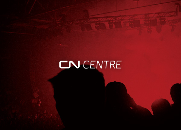
When CN acquired the naming rights to the Prince George Multiplex, we helped them integrate the two identities. One of the first steps was a simple form that paired the iconic CN mark with a smashLAB designed typeface (named after the city in which the CN Centre is located).

Paired with the “we’ll move you” tagline, the logo works in single color settings, or in two-tone ones like we find here. These same tones are found in collateral items like the business cards, pictured to the right.

The line found in the CN mark was extended and brought to life in the CN Centre identity. It spins, groups, and contorts to represent singers, lacrosse players, skaters, conference attendees, hockey players, circus performers, figure skaters, and a number of other figures to be found at the facility.
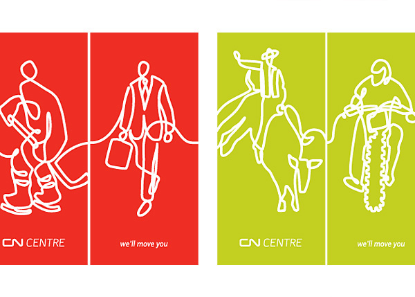

Festive banners designed to adorn the exterior of the building help convey the fun to be had there, while bringing color and excitement to the setting. It’s worth noting that the lines always terminate at the same point, allowing these illustrations to be linked together easily.

An involved signage system helps bring life to the facility. Pictured (from top left, clockwise): entry wayfinding signage for the perimeter of the building; section markers; door signage; section signage for inside the arena (specifically, in the stands).
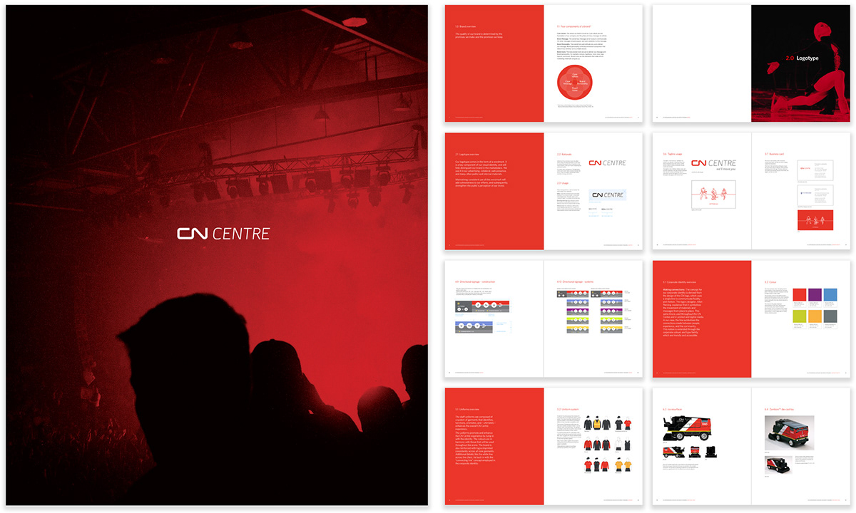
A ~100 page brand standards manual helps current, and future, management and staff quickly orient themselves in the brand system. Containing all the key messaging, color codes, sourcing information, digital files, and other applied information, it’s a rather handy document.


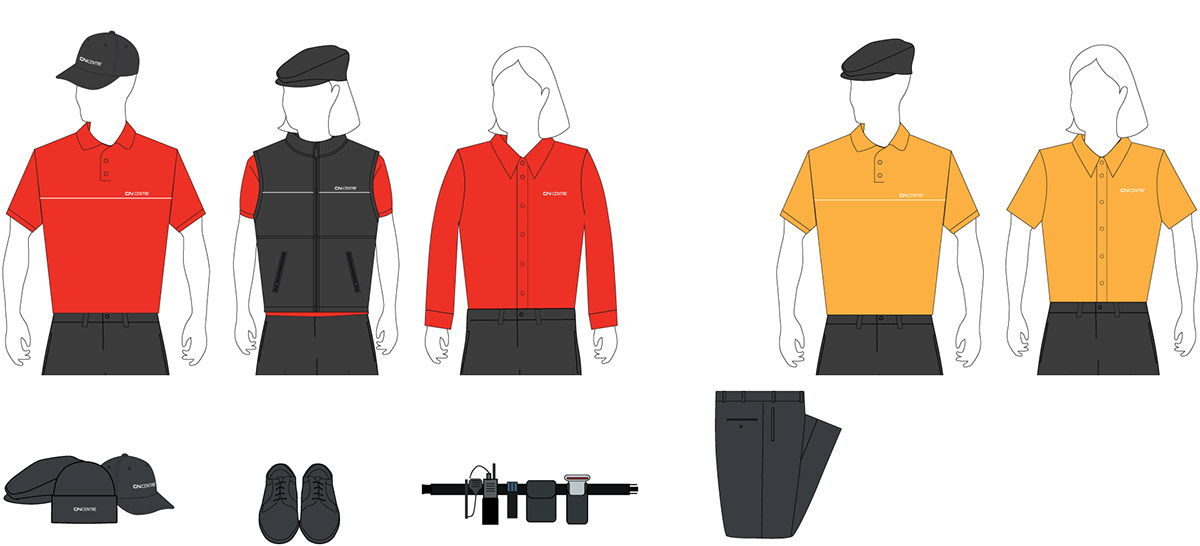
Staff uniforms take into account the need to be able to easily identify Security, Food Services, First-Aid, Traffic, and other staff within the building. Practical items like headwear, tool belts, functional pants, and so on, are sourced and detailed in the documentation, allowing for easy procurement.

Access passes and lanyards for facility management and staff are designed for internal preparation, use, and administration. Each utilizes a holographic logo and bar code to help mitigate counterfeiting and misrepresentation.
View full case study here.

